It’s a trend we’ve been seeing in consumer product design — displays are going bezeless.
It started with TVs sometime ago, and manufacturers are carrying that philosophy to phones as well. The rationale here is that the bezel or frame which holds together the display unit does not serve any other purpose to the user, hence is “chrome.” Minimising (or altogether eliminating) it enables more content to be displayed without physically increasing the size of the display. Applying this thought to interfaces would yield similar returns — less interface chrome means more space for the content to shine through.
But this is nothing new. Interface designers have been balancing content and chrome since the early days of GUI design. We know the old adage — reduce interface chrome and make the content the interface. Or as Edward Tufte said, “The information is the interface, not computer administrative debris.”
A good example is Netflix, on past iterations of their web app.
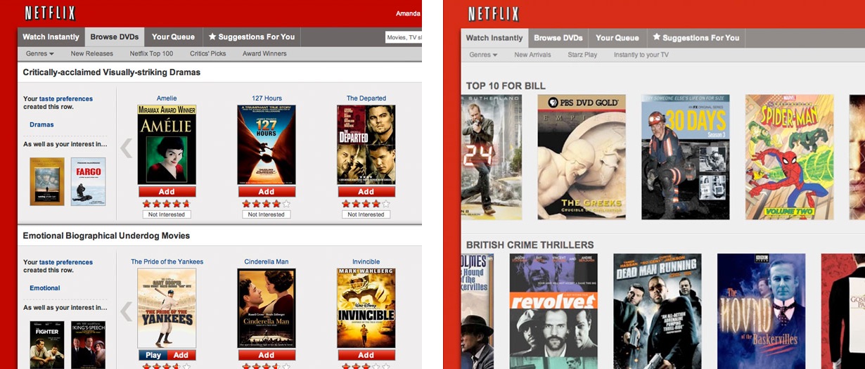
On the left, you can see chrome in the form of ratings, unnecessary buttons, filters and other panels; which were removed in the later version on the right. Luke Wroblewski has documented how Netflix applied NUI principles to simplify their interfaces, if you’re interested.
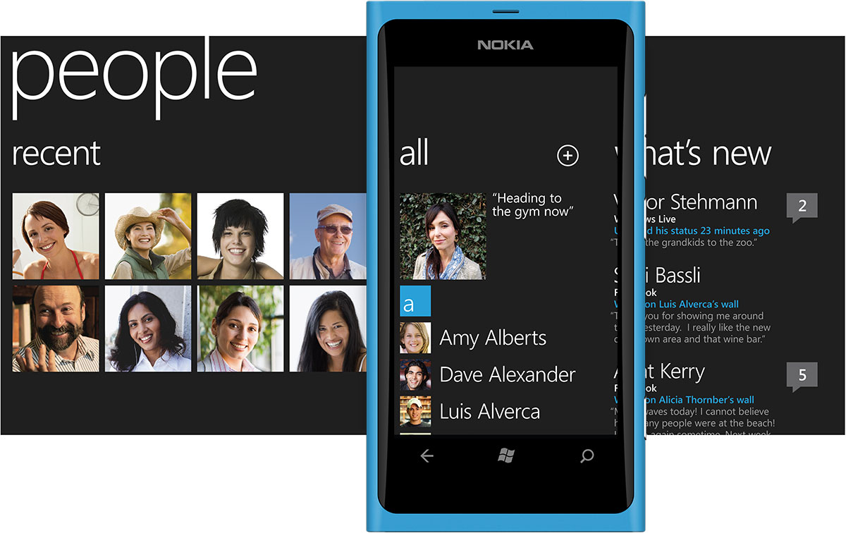
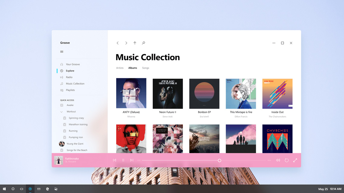
One of the earliest examples of near-chromeless GUI design deployed on a mass scale were Windows Phone 7 apps designed with the Microsoft Design Language (formerly Metro or Modern style). Debuting way back in October 2010, Microsoft Design Language was heavily influenced by the International Typographic Style and its underlying principles — use of grid systems, clear typography, vibrant colours and objective imagery.
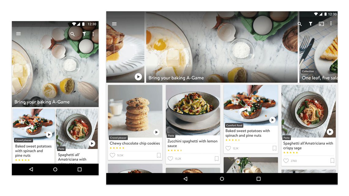
Minus the blue bar at the bottom, there is almost no chrome at all. Instagram treats the content as the interface which you can directly manipulate via taps, scrolls or gestures. This is standard practice today, but was not the case back in 2013. This was chromeless design at its best, and it looked and felt ahead of its time.
Too far a leap
Chromeless interfaces are inherently minimalist, and so are synonymous with flat design. And Microsoft became its biggest evangelist for the better part of the last decade. This philosophy was then applied across a range of devices from phones and tablets to game consoles and desktops; and Microsoft attributed this impressive plasticity to its treatment of content as the interface.
But it wasn’t without its share of problems, and the biggest criticism of chromeless interfaces and flat design was that usability suffered.
Microsoft’s Windows OS in particular experienced severe backlash. Without traditional menus and manipulation controls visible at hand, and visual cues like shadows that signified depth on a two-dimensional medium; users struggled to find their way around.
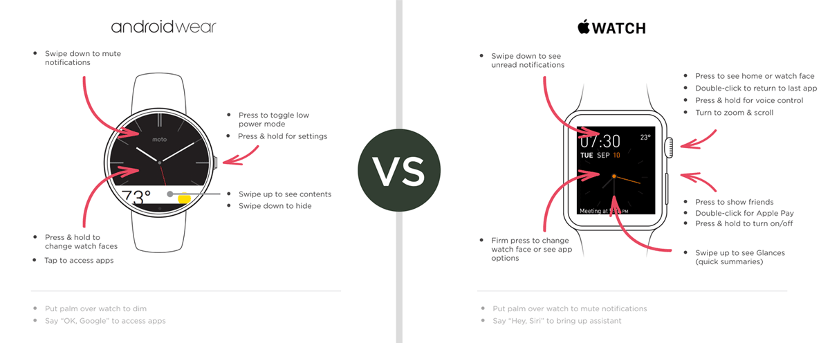
To get a sense of what this means, consider smartwatch interfaces today. The extremely limited screen estate means controls have to be out of sight. These watches have similar functionality but wildly varying means of invoking them, which is problematic for users.
They demonstrate that chromeless interfaces take some getting used to because they rely heavily on muscle memory, as Luke Wroblewski observes in The Invisible Interface:
When there’s no graphical user interface (icons, labels, etc.) in a product to guide us, our memory becomes the UI. That is, we need to remember the hidden voice and gesture commands that operate our devices. And these controls are likely to differ per device making the task even harder.
Microsoft was designing to bring about the future, but it didn’t account for the reality of the present — consumers were not ready for such a leap.
Pragmatism and tradeoffs
Microsoft’s digital purity gave way to Google’s pragmatism. Circa 2014, Material Design corrected all the usability problems of the chromeless + flat philosophy by establishing a unified framework for interface elements and marrying it with the Flat 2.0 aesthetic that was gaining popularity at the time.
The reception was unanimously positive — designers and engineers everywhere were aflutter with praise for Material Design.
In fact, Microsoft themselves recently showcased their Fluent design system, the successor to Microsoft Design Language used across Windows 10. In terms of a UI framework and its treatment of chrome, it was identical to Material Design.
This is where we stand at the moment. Design sensibilities have hit a plateau. We have established patterns and guidelines for design across devices and product ecosystems. Apple, AirBnb, Facebook, Google, Microsoft and other big companies influencing product design today seem to agree that absolutely chromeless interfaces are not practical — at least for the moment. Product design has become homogenous, and that’s not necessarily a bad thing.
But what does the future hold?
Gazing into the crystal ball
Kirill Grouchnikov has been documenting interfaces from sci-fi films since 2011 at his blog Pushing Pixels. From Prometheus to Oblivion to Iron Man to Tron: Legacy and others, he calls them fantasy user interfaces (FUI).
Another interesting take on interfaces of the future comes from Microsoft’s Future Vision videos. As the name suggests, they offer a glimpse into the future of the workplace through Microsoft’s rose-colored glasses.
It’s easy to dismiss these as marketing gimmicks or just wishful thinking. But this future may not be very far away. And looking closely at these interfaces, two things stand out at once.
They’re almost entirely chromeless.
They are visually flat, or almost flat.
Interface chrome seems to be minimal — limited to button groups and simple menus. Most interactions are happening via natural language and memorised gestures. Considering this future becomes a reality, the logical question is: how would users figure out how to use these interfaces?
Well, it’s established that each subsequent generation understands affordances through experience and expectation. Andrew Coyle explains this succinctly:
The pinch and zoom interaction on a mobile map is not inherently intuitive. Users learn it once, perhaps by accident, luck, or word of mouth, and it is forever ingrained in their minds. This type of interaction is discoverable because it is built upon the expectation that a user can zoom in on a digital map. Before mobile touch-screens, users clicked a zoom button on maps that were rendered on a web browser. The prevalence of this possibility presents the expectation in other contexts, which allows the cue to fade away.
Digital affordances, unlike their real-world counterparts, are continuously evolving. In fact, Apple is a company that is generally cautious about following trends, but even they made many bold moves in iOS 7; one of which was button styling. Apple’s designers seem to agree that a button today doesn’t have to look like a real-world button with drop shadows and bevels. There only has to be some visual cue that explains its interactivity.
It’s almost certain that interaction patterns will evolve past the taps and gestures we use on our devices at present. For example, Siri can do a lot and the Amazon Echo has already demonstrated the potential of natural language recognition. A simple phrase like “Ok Google” allows for a lot of visual chrome to be hidden and kept accessible on-demand. So future interfaces could display purely content and reveal chrome when requested via natural language, gestures or even specific hardware peripherals.
One good example of the last category is Microsoft’s Surface Dial, a controller that allows users to customise and navigate interfaces on the Surface Studio.
Interface design is far from mature, and that’s precisely what makes it so intriguing and rewarding. Digital technology will always outpace society’s understanding of it. The goal of design is to simplify technology’s trajectory by developing a story around it that users can understand.
As product designers, we’re all playing our parts in the telling of that story.