The 2011 award-winning documentary Jiro Dreams of Sushi profiles legendary shokunin Jiro Ono in his lifelong pursuit of perfecting the art of sushi. Ono’s restaurant Sukiyabashi Jiro is the only sushi bar in the world with three Michelin stars, and it caters to just 10 customers at a time.
There is an almost unreasonable amount of care and attention to detail that goes into the preparation of each course, so it’s easy to see why Michelin three-star experiences like Ono’s cannot be replicated at scale.
With digital experiences though, it is quite the opposite. Silicon Valley is obsessed with scale. We dream about it all the time. It’s a product consideration from day 1.
“It’s nice, but interactions like those don’t scale.”
“How many concurrent transactions can this component handle?”
“Can our servers take this much traffic?”
But that’s what startups are designed for, right? Growth. Everything you contribute should scale in a meaningful way — design, code, talent acquisition… the works. You should always be thinking of the bigger picture.
Scale is a significant consideration in brand identity design. You may design a logo for a mom-and-pop burger joint that may turn out to be the next McDonald’s. The great logos of the world are designed with an eye on the future — you never know where your logo will turn up. The Nike “swoosh” and the Apple “apple” are two examples. The Apple logo is fascinating because it works as a 120px app icon, or on a digital billboard in Times Square. Its designer Rob Janoff revealed in 2009 that the shape and size of the bite serve to make the mark discernible as an apple, and not any generic round fruit.
But some of the most iconic logos designed before the Internet era — Apple’s original logo included — do not cross over very well. Pentagram was recently commissioned to recalibrate two such classic logos.
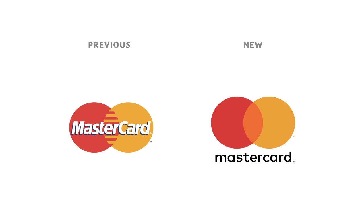
Mastercard’s logo has been on payment cards since 1966. It went through numerous iterations over the years, gradually separating the word mark from the symbol mark. Today, the iconic coloured circles are recognisable by themselves.
So it pays to think about the long-term implications of what we build as creators, but we should also be cognizant of the consequences of prioritising scale over all else. It’s so tempting to automate and streamline everything for a million users from day 1, and that’s where we add needless complexity to our product.
Getting to a million users itself is a great problem to have. One that only a tiny percentage of startups actually need to worry about. Stop wasting your time preparing for a bridge you may never have to cross!
Programmers spend far too much time worrying about whether their stack will scale up, and far too little addressing the real danger of whether it can scale down. Small teams bet – and lose! – the farm on big tech solutions to banal problems all the f***ing time ••• Facebook was built on vanilla PHP and when that wasn’t fast enough for 2.6B people, they wrote a VM and fixed it ••• It’s exceedingly unlikely that whatever environment you pick will prohibit you from reaching the sun.David Heinemeier Hansson
Scaling code is easy, but scaling meaningful, human interactions is hard. There’s no lack of consensus about that, even in marketing:
Very few companies manage to advertise in a respectful, creative way and connect with me like a real human, not some marketing persona. Thoughtful, intentional marketing is hard — and probably doesn’t scale well. In many ways, it follows the exact opposite approach of the typical growth hacker mindset.Kai Brach
Design is no exception. The most notable manifestations of our community’s obsession with speed and scale come in the form of UI frameworks and design systems. The big boys — Apple, Google, AirBnb, Atlassian, Shopify and others — all have design systems and component libraries. And so we must too, even if have absolutely no need of it right now!
It’s mostly just signalling, and I’m guilty of it too.
Bootstrap and other frameworks form the basis of hundreds of themes for WordPress and other leading CMSs, but their large footprint is overkill for simple sites and blogs. A look at some of the top-selling themes on Themeforest gives a clear indication of how homogenous the entire space has become.
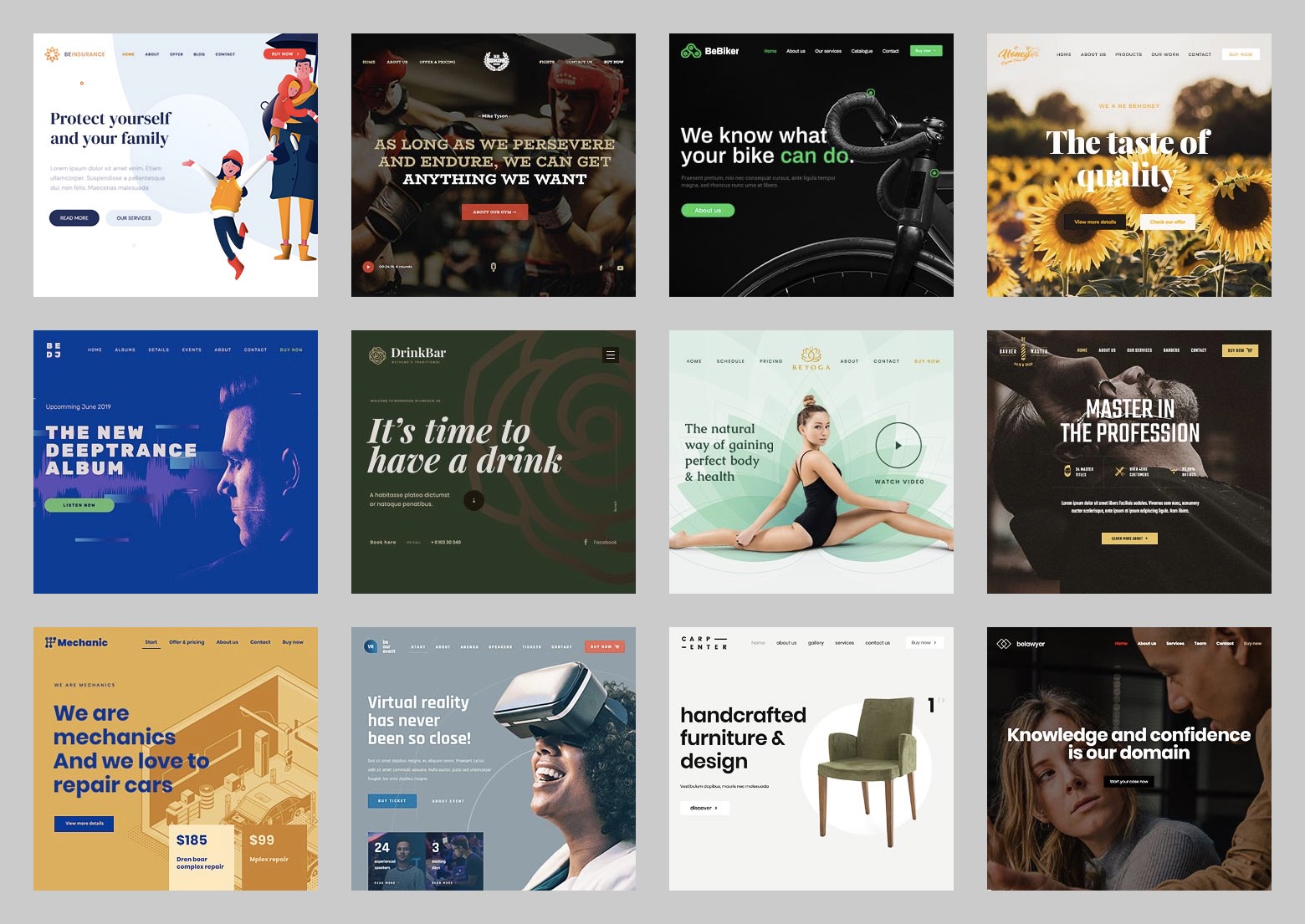
Trendy but generic, unopinonated visual design.
Stuffed with templates, layouts and styles that are rarely used.
On top of a bloated, redundant and non-semantic codebase.
Now don’t get me wrong. I’m a fan of templates and frameworks where it makes sense, and there is clearly a market for off-the-shelf themes. But something very tangible is lost when you prioritise mass market appeal and scale design to this point. Frank Chimero elucidates this in Designing In The Borderlands:
How can we design things so that they are useful, scaleable and maintainable? ••• This kind of construction often forces a brute simplicity. This fulfills the need for interchangeable, stable pieces, but often zaps the potential for heart, individuality, and resonance. I’ve come to understand that some things are truly diminished when they are simplified and forced to scale.
Heart. Individuality. Resonance. These mark the difference between average, cookie-cutter products and truly excellent ones. Between high-end restaurants and Michelin-starred restaurants.
I yearn for the golden days of web design. Some of the most memorable sites I’ve seen come from times before UI frameworks and design systems were a thing.
Design from that era used to exude so much character, so much soul. They didn’t use fancy frameworks or design systems. The CSS was mostly custom, except for maybe the Reset. They didn’t require complex build scripts. Most important of all, these sites spoke to their audiences. They really connected with you through clever copy, simple aesthetic flourishes, excellent typography and delightful microinteractions.
You never meet the people, you never shake their hands, you never hear their story or tell them yours, but somehow in the act of making something with a great deal of care and love, something’s transmitted there.Steve Jobs audio clip from the 2017 Apple Special Event
Enough chatter. Let me give you a few examples of what I mean. The links below are from Wayback Machine, so you’ll perhaps get some sense of the look and feel of these sites.
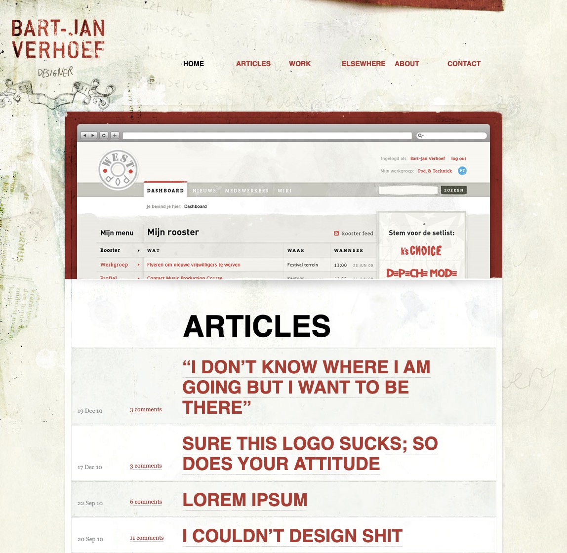
One of my earliest design heroes was Bart-Jan Verhoef, a Dutch designer with a penchant for textures and worn-out type. I spent weeks dissecting the source code of his personal site — it was a treasure trove of details of every sort. Look closely at the header background — he made that himself by scanning and combining worn-out paper, type blocks and his own handwriting. The site does an excellent job at communicating his unique style and self-professed love of making things with his hands.
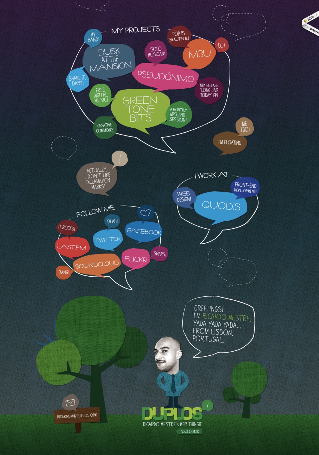
Business-card-style personal sites were huge many years ago. Most designers at the time wrote in third person and took themselves way too seriously. Ricardo Mestre’s personal site had a playful character with scrolling starting from the bottom, plus loads of cool touches like the monster lurking behind the tree at the bottom left! His current site still pays homage to this design.
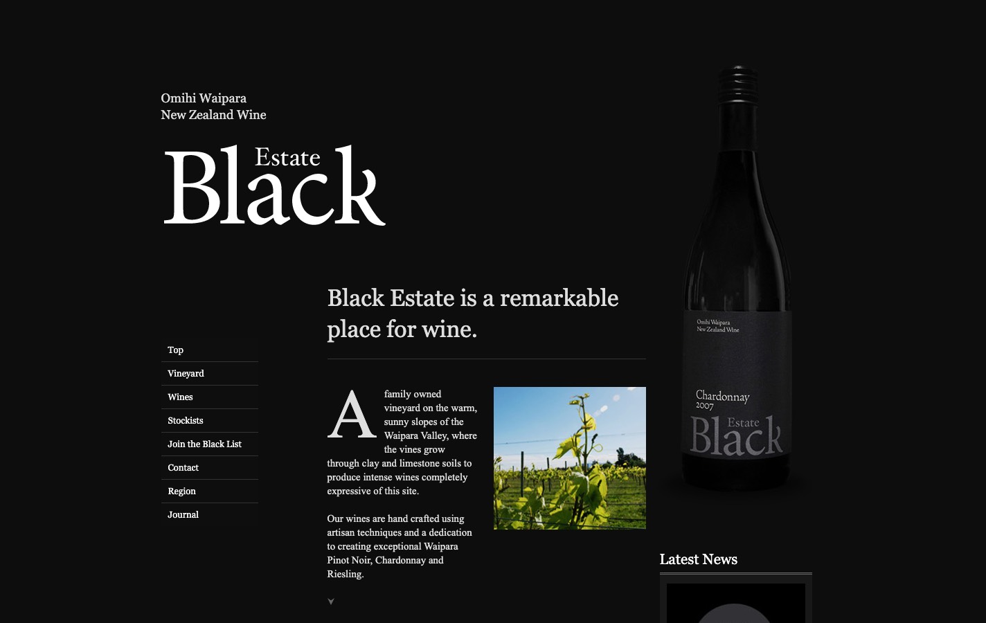
Black Estate is a wine company based in New Zealand. This layout was magazine-inspired at a time everyone was doing single and two-column layouts. Combined with deep blacks and sharp serifs, this iteration of their microsite was an excellent extension of their brand. Unfortunately, their current site is a far cry from this version.
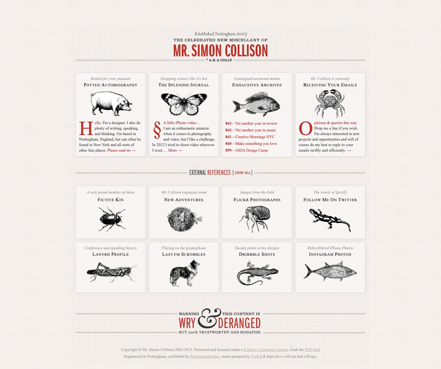
Even though his current timeline-inspired site is excellent, this version of Simon Collison’s personal site is one that always tugs at my heartstrings with its Victorian callbacks via illustration and copy. It was also one of the first examples of adaptive web design, at a time responsive was becoming the norm.
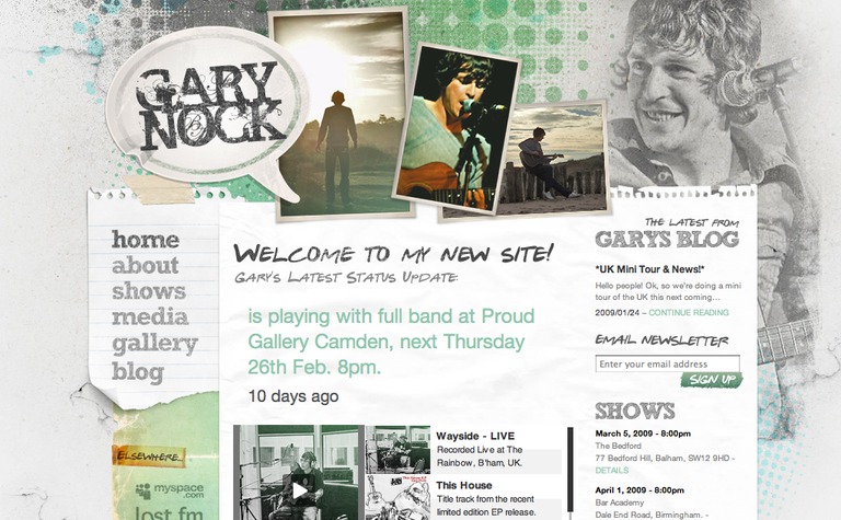
Musician Gary Nock’s site from over a decade ago was a work of art! And it was featured on almost every single CSS gallery I can remember. One of the pioneers of the skeuomorphic aesthetic on the web, doesn’t it almost make you want to reach out and peel off one of those pieces of notepaper? It’s sad that responsive design and performance considerations have totally robbed us of the opportunity to make sites like this today.
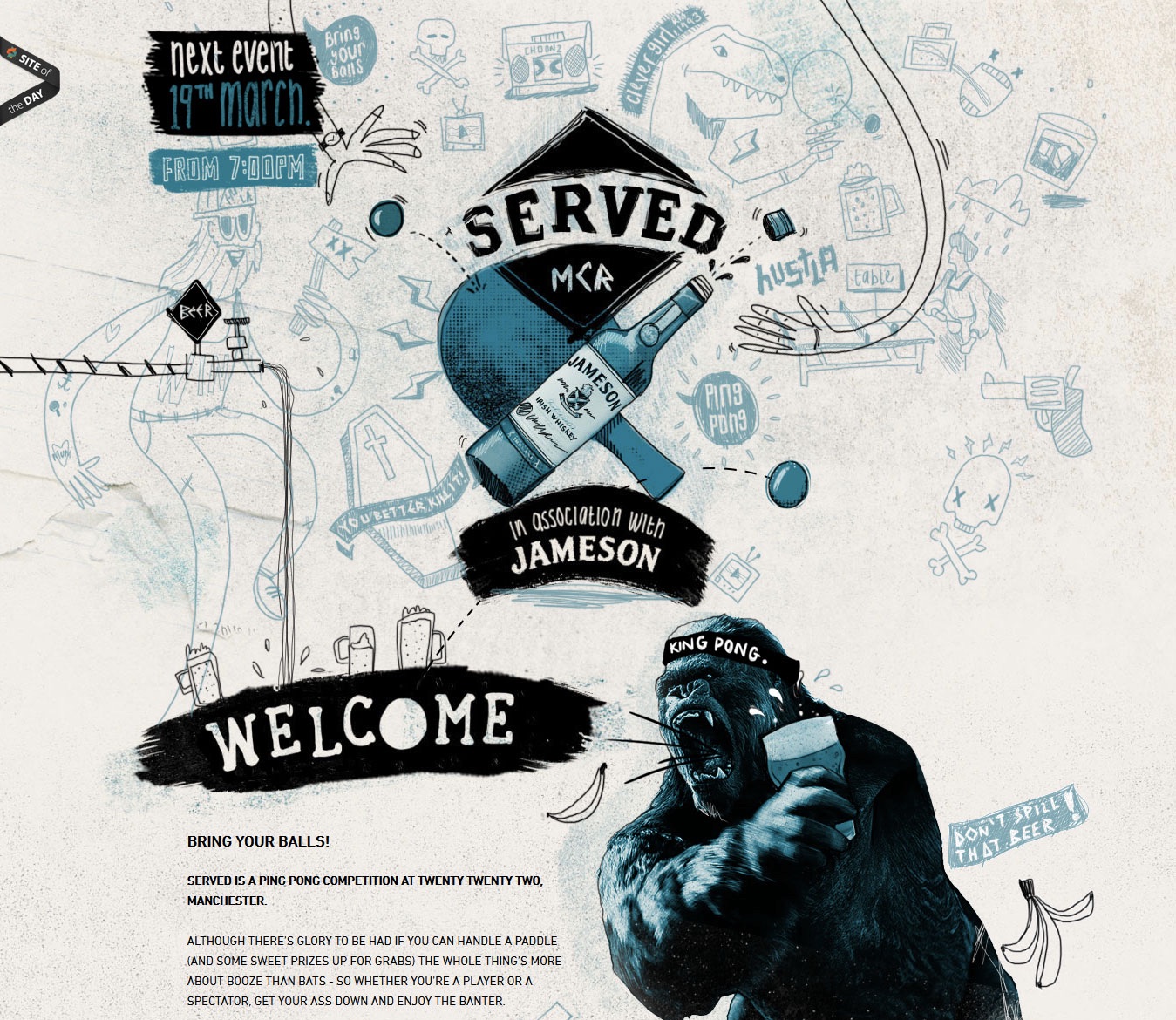
Illustration in web design has become a staple over the last several years, but most sites use the same, predictable aesthetic. This website for a UK ping-pong tournament was just insane! If you ask me, the level of detailing in the illustrations, combined with the vector-raster mashups and clever copy make Served one of the standout promo landing pages of all time.
A couple of web apps now — Virgin America took a big risk pushing this colourful, quirky, futuristic booking experience back in 2015. Wired called it “the first radical rethinking of the flight booking experience in a decade.” Kudos, Work & Co. Virgin America merged with Alaska Airlines in 2018, taking down all their digital properties in the process.
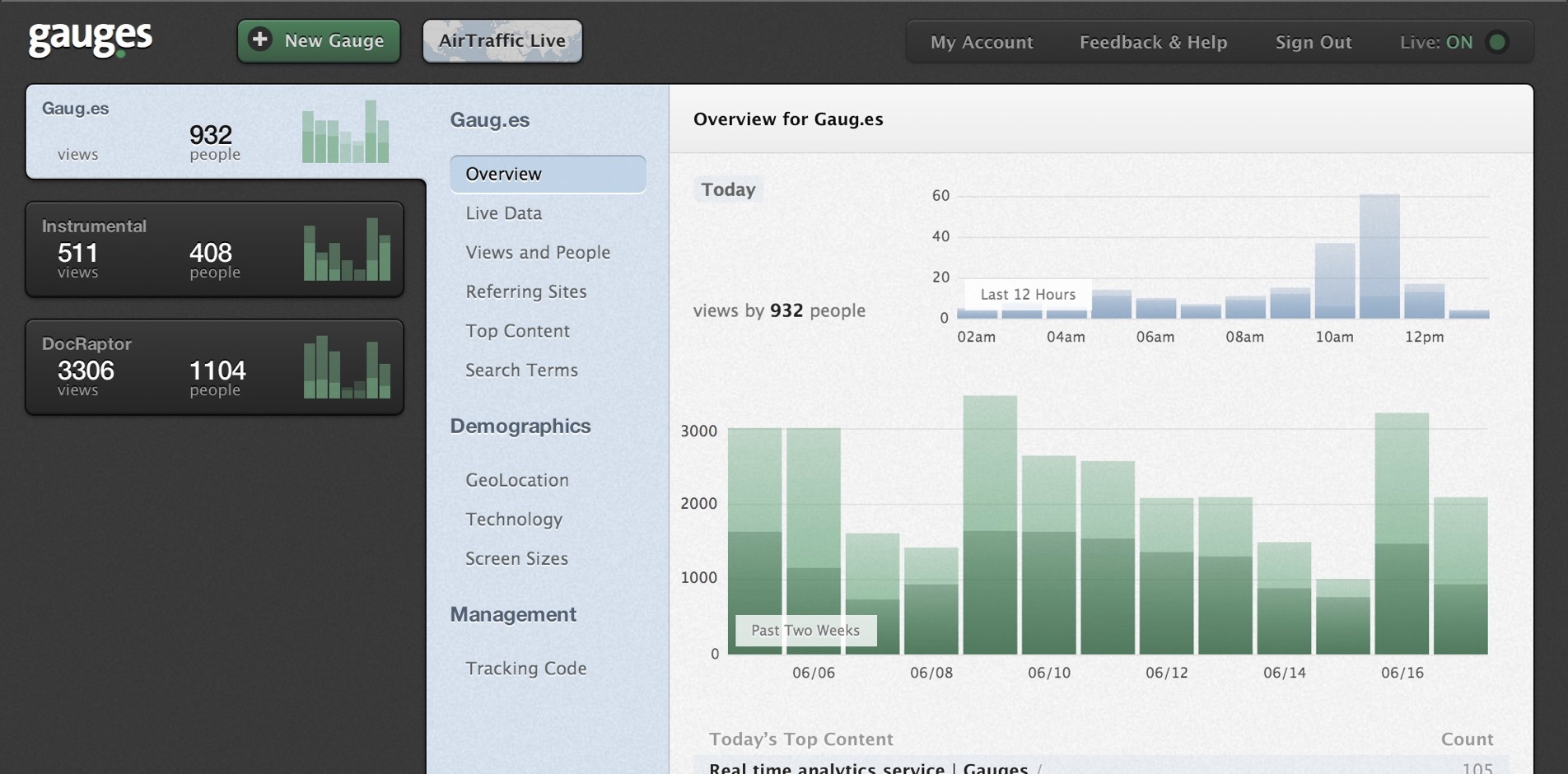
Gauges is another web app I think belongs on this list. Its side navigation looked so cool back in the day. Compared to very sterile-looking competitors at the time (like Google Analytics); it used texture, typography and a very unique teal+black color palette tastefully to stand out. Its aesthetic hasn’t changed much over the last 5 years.
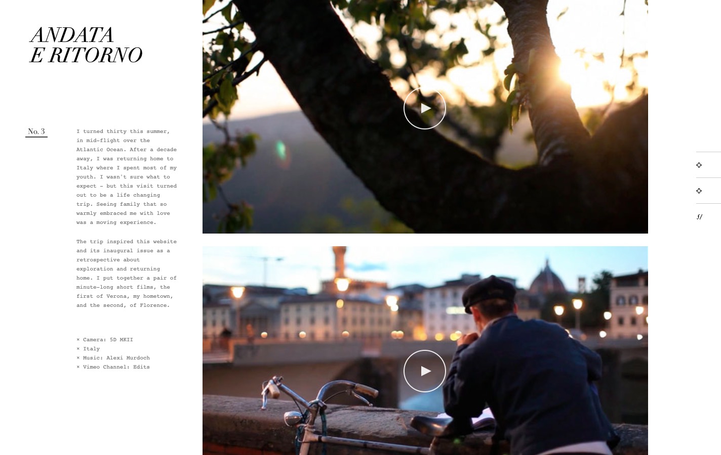
I’ll round up this selection with my favourite blog design of all time — Ian Coyle’s Edits Quarterly. I assume he never found the time to update it past the inaugural first issue. I normally hate scrolljacking of any sort, but I absolutely adore the overlapping parallax effect the site affords. Other small touches make a world of a difference, like the tasteful interludes that follow every couple of articles.
We have been conditioned to think largely in terms of scale, performance and mass-market appeal; which is what makes these sites so unique today. I hope the list above enourages you to challenge the status quo when you can as a creator — the difference is night and day.
These sites are the digital equivalents of the Sukiyabashi Jiro experience. Study them, enjoy them and celebrate them — we don’t make ‘em like this anymore.